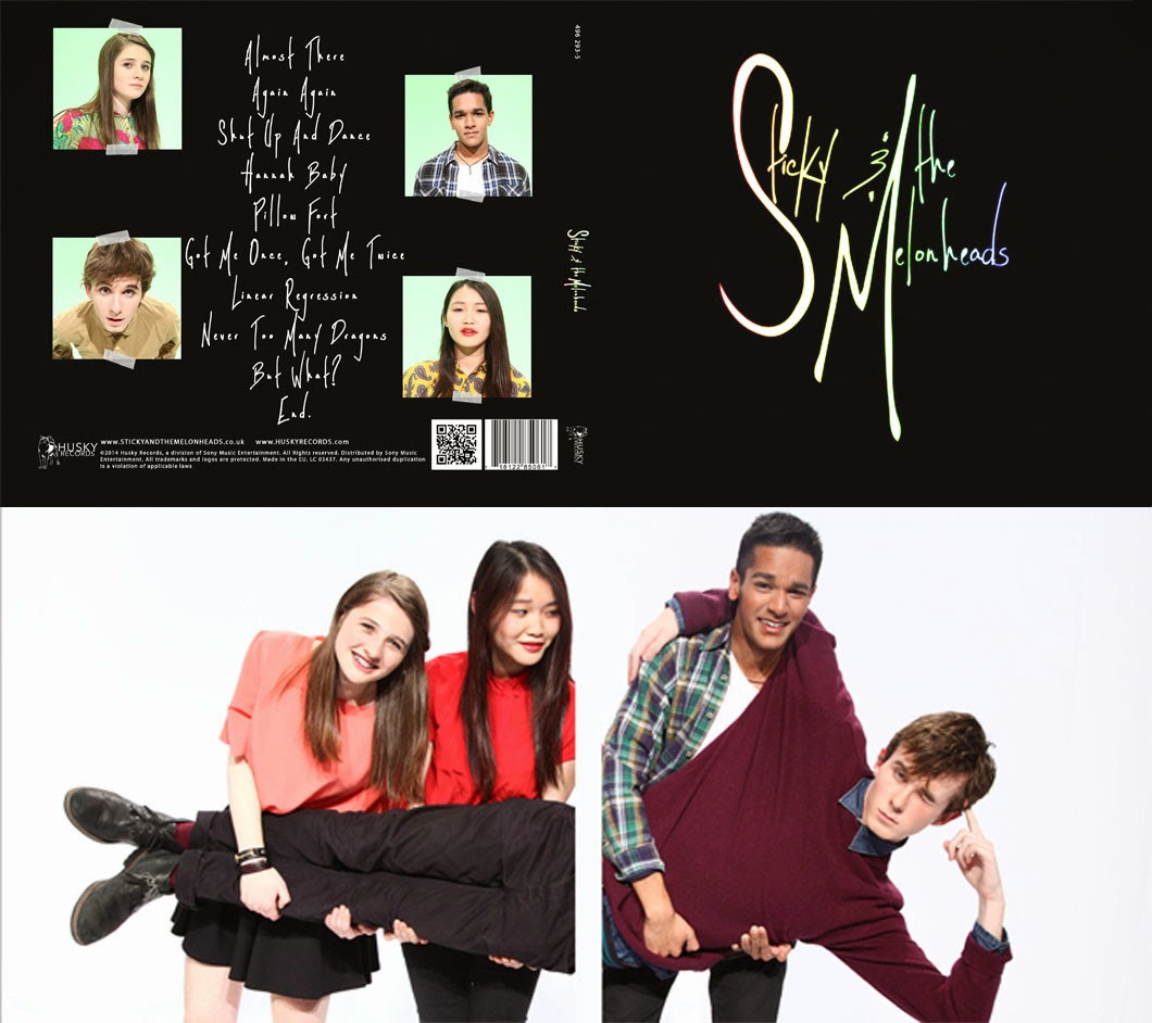
I feel that we were able to effectively combine our main product and ancillary texts, especially through our easily identifiable brand identity created by our constant recurring themes used across all the texts. As Richard Dyer said, an artist is a product of a record company and needs to be packaged and sold to audience, to do this we must have their band image consistent throughout all the texts. Our website, music video and album cover all have a clear link with the strong sense of brand and band identity which creates a synergistic and an effective cross-platform marketing campaign.
Band Image:
The band image is one of the most important things to establish in a campaign for the audience to recognise them and relate to them. Below is a world cloud of traits our 'pop star' has:

Without band image set, we made sure to express that throughout all our texts:
Music Video:

 The band image is conveyed through each members actions and costume. They move to the music and their facial expressions show their friendly and fun side as well as showing their passion for music since they're enjoying it too.
In the different eras, we use bright colours to portray our bands light-hearted and fun image as an indie-pop band.
Album Art:
Website:
We used The 1975's marketing campaign as an example:
 |
| The 1975's logo fading in |
Keeping the band image consistent through all the texts makes sure it creates a synergistic campaign. So overall, I think our campaign was fairly effective as our band image was able to be portrayed in all forms of text. However for our music video, we could have improved it by linking it to our album or website. Possibly including 'Out now' or maybe our band logo which is what 'The 1975' does at the beginning of all their music videos.


No comments:
Post a Comment