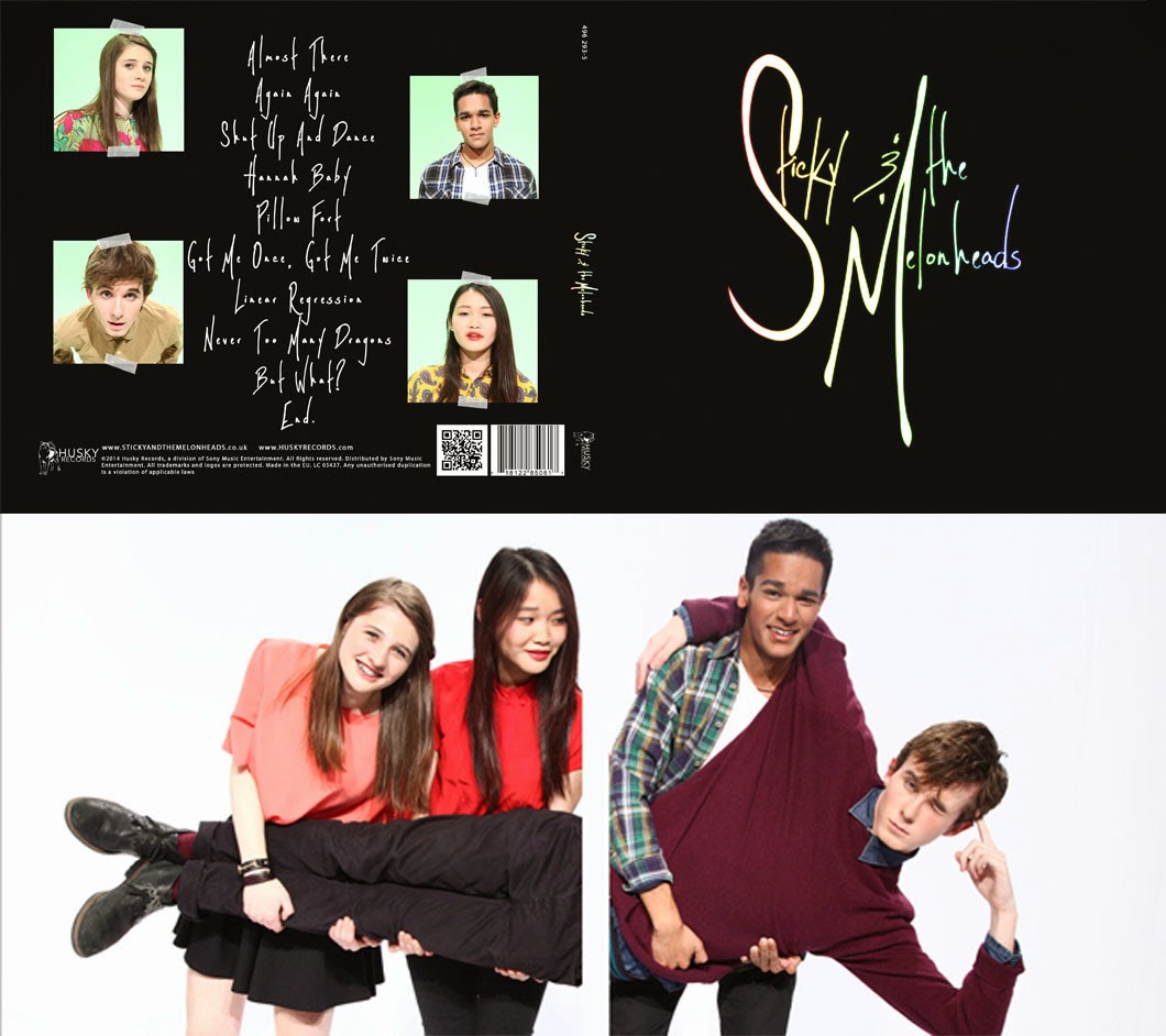
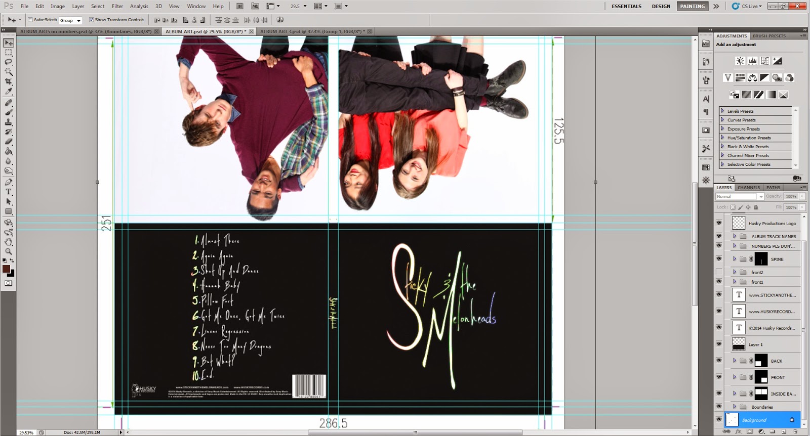
As I said before, we wanted a minimalistic design. On the outside it would be plain and cool, but on the inside it would show the band's quirkiness. We wanted the contrast between the white and lighthearted inside to the black and cool outside.
However after receiving feedback from our teacher we realised that the back cover of the digipak was not good enough. We used The 1975 as a reference however they had 2 colomns of track list, making it look less plain.
 |
| Gallery Style |
We thought about doing it like our website gallery, which we did like but we wouldn't get the impact of the contrast between the inside and outside of the album digipak.
Trying to keep our band image constant from the website to the album, we tried the rainbow colours border with the sticky tapes, which look aesthetically pleasing but still lacked something.
In the end we were finally able to settle on one design:
This had small images of the band members but not too big that it was overwhelming, just the right size. Since they were smell we would still get the contrast. The poses of the members were all 'calm and cool' which contrasted with the image on the inside...
...revealing their quirky personalities.


No comments:
Post a Comment