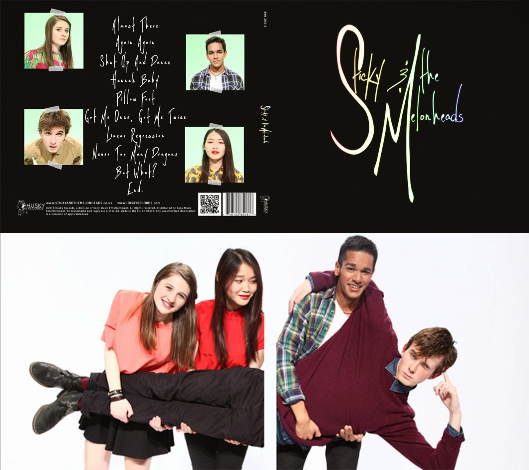
Therefore to make everything link to each other, that would be our album cover for the bands debut as well as used on our website. This maintains the bands image consistent throughout the campaign of the album and keep the a synergistic promotional strategy.
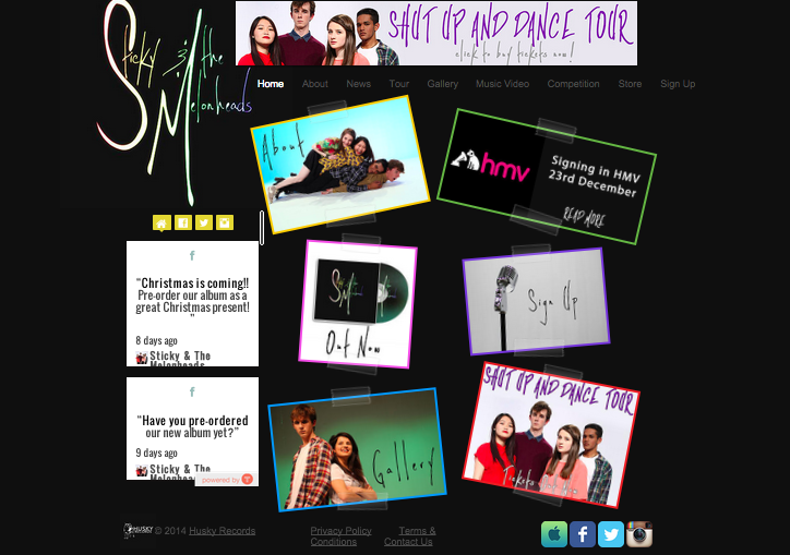
This is our old homepage:
| Old Home Page |
Since our band is called Sticky & The Melonheads, we decided to incorporate the 'sticky' in our theme aswell using the sticky tape design. This is consistent between our website and album cover.
This feature is used throughout all the pages on our website, not only the home page:
We even used the colours that are tinted on our logo as the borders on our website, giving the website some contrast between the black background and the images.
Since having the same design on every page will be boring, we decided to add some variation in our gallery. We used the 'accordian' design as a gallery and when scrolled over, the gallery will open up on the image which is hovered over, also when you click on the image it opens up.
The variation of display for the gallery provides an interesting and different way to interact with the website, engaging the audience.
After reviewing our blog with peers, we found a problem with our homepage. Though we loved it aesthetically, it did not have any information that the audience can see straight away when they went on our website. Being able to gain information easily and quickly is the whole point of an artist's website.
We liked the layout of it, so we kept it fairly similar. Since the text says what the image links too is too small, we decided to have them be written on the image itself, so it's not strenuous to see what the text says. For the text on the images, we kept the same font as the logo, keeping a consistent image throughout the website. After that change, we still thought that the homepage was lacking information.
We then found a live social media feed, which allows the audience to see what the band are up to directly from the website. This is an instant way for people to connect with the band even if they didn't have social media. It is an immediate way of promoting the band aswell.
After adding all the changes, there was still some gap that needed to be filled so we decided to directly promote our album by having the 'Out Now' on an image of the CD, which links to the store, and a sign up image which links to the sign up page.
Below is the result of all the changes we had made:
 |
| New Homepage |


No comments:
Post a Comment