In this meeting, we made our objective to share our album cover and website ideas to each other.
 |
| Brandon's Idea |
 |
Juliette's Idea
|
 |
| Audrey's Idea |
 |
| Juliette's Idea |
These were the ideas that our group had and in the end we decided on having the plain album logo to match the general indie album covers. The logo would have the primary colours to connote the genre of pop in the indie scene. The contrast of the black background and the colourful stylistic logo, despite being simple, still has the connotations of an indie pop band.
What is usually also typical for a indie band thats just debuted is for them to state their genre really easily and we decided to just have the band name as the front cover to leave more of an impact on the audiences mind, so they remember the name and may even research the band more in detail.
Our influences include:
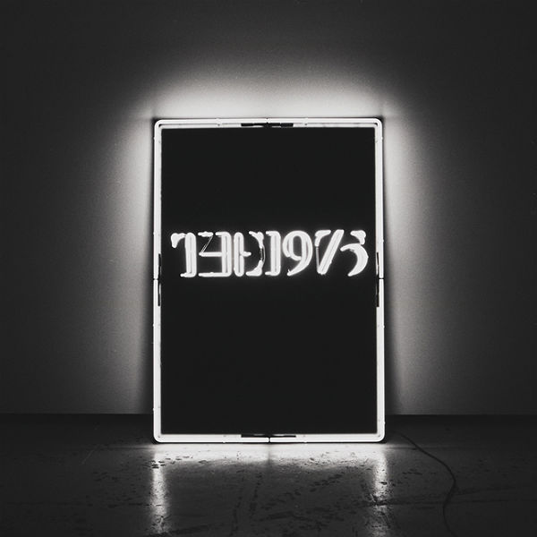 |
| The 1975 Album Cover |
 |
| Franz Ferdinand Album Cover |
 |
| Daft Punk Album Cover |
From these examples, we liked the black background and how it contrasted with the typography that stands out in the middle of the album cover.
For the font of the band logo, Juliette did some research beforehand and gave us a few choices to decide what suits the band more.
Out of all of the above, we decided on the Little Sparrow font (tops left). From there Juliette experimented with colours of the letters since we already decided that the background would be black.
In the end, we decided on the the first logo, this is because the primary colours that connote pop with the simply font and black background, giving the logo the indie feel. With this decided, our front cover of the album was done and dusted.
As for the back cover, we looked at a few examples:
 |
| The 1975 Album Back Cover |
 |
| The XX Album Back Cover |
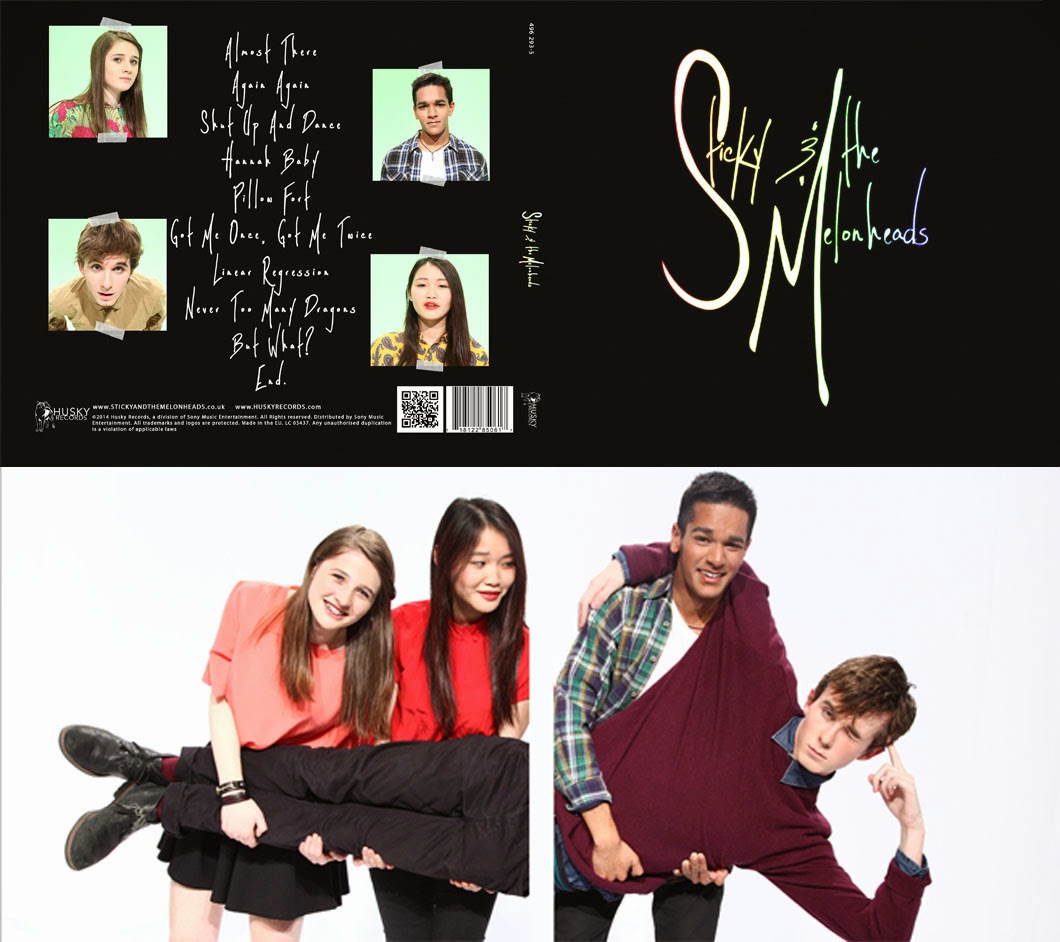
Following this trend we thought our Album back cover would also be black to keep the black trending throughout the whole album cover. The tracks would then be written in a different font to the logo, a more simple font like in the ones above. The numbers for the tracks would be in the Little Sparrow font and each number would be in the colours in the band logo.
On the inside of the digipack, we all had a similar idea of having the band to be inside. Though we had not yet thought of a pose for them, we had a rough idea of the band posing like the image of Everythign Everything below.
 |
| Everything Everything |
Website Designs
 |
| Juliette's Website Design 1 |
 |
| Brandon's Website Design |
 |
| Juliette's Website Design 2 |
During the same production meeting as the album cover, Brandon and Juliette shared their ideas for the website. In the end, we decided on Juliette's website design 2, have a landing page that would directly link you to the home page of the website; on this page, we only want the band logo to be the main focus. This is the typical self promotion bands use to engrave their name into the audiences minds.
For the website itself, we were influenced by The 1975's website's collage-like homepage.
 |
| The 1975 Website |
However with The 1975, they had a constant stream of information being displayed, which we did not want. So instead we decided on having images on the homepage which the audience can click to reach different parts of the website. This makes it easier for our audience to navigate through our website easily, with such easy navigation, they can easily access and buy tickets or merchandise.


No comments:
Post a Comment